Customizing your product with Figma variables

Figma variables have changed how designers work – from creating prototypes that feel closer to the final product, to building and maintaining a multi-theme, multi-brand design system in an efficient way. In this article, find out how to build a themeable design system and how much it enhances your workflow and collaboration with stakeholders and development.


Author: Anca Stumbea

Anca Stumbea

UI/UX Designer

Earlier this year, Figma released variables, which are stored values that can represent colors, dimensions, spacing, booleans, numbers and text. Variables usually are associated with tokens, but the main difference is that variables are mainly used in the design area.

Why use variables in your Figma design files?

There are many advantages to using variables in your design files, such as:

  • Better efficiency when managing a design system or multiple design systems;
  • Build complex prototypes with conditional logics (for example, when creating a quiz with various questions where the users have to answer them, and they can get immediate feedback if the answer is correct or incorrect);
  • Switch between different device sizes using dimensions and spacing rules set by variables;
  • Preview language changes and text flow using text variables;
  • Create complex prototypes using number variables – for example, a checkout cart that calculates live the total number of items, increasing the quantity of an item and decreasing it, and calculating the total amount to pay.

Variables vs. Styles

Styles have been around in Figma for a long time and it helped optimize design systems across multiple files. Even with variables being available, styles are still quite useful until further updates are made on variables (which are still in Beta). Here’s a list of pros and cons for each:

Customizing your product using Figma variables – Preparations

For this article, we will consider that we already are a UI/UX Designer for a small Coffee Shop, where they have a self-order application in place which you can use inside of the shop to browse and order different kinds of coffee, tea, and other beverages.

The owner of this Coffee Shop informs us that they want to expand their small shop into a chain of stores, for which they want to have different color palettes with light mode and dark mode, and also with the option to change how the buttons look as well – either rectangular, round or in-between. We have been given which color palettes they want to use. After adapting them in our designs, we have checked the designs’ look & feel with the Coffee Shop owner before starting to build our variables:

With styles, we would need to create different libraries for both Light theme and Dark theme, along with different libraries for the three color palettes – Burgundy Berry, Blue Purple and Green Leaf, which would mean extra maintenance in our design files. But with variables, we can create all the color palettes and themes in the same file we’re working on (or in our design system), which will make the whole design process more efficient, easier to maintain and scalable across files. Here is an example of how color variables are connected in a hierarchy:

Above is a chip of a variable and what it calls to: a HEX color code (but can also be RGB, HSL, HSB) or another variable – the latter is useful especially when you want to control branches of different elements’ attributes.

In the picture above, we can already see what a variable actually means: keeping a connection between latter elements in a hierarchy, but making the newer variable’s naming more specific to your needs, which not only increases your workflow, but also design handoff to developers. As naming rules, the farther you expand your hierarchy, it’s best to have a delimitator to show how far you are from a “parent” variable, which, for our variables collection, it’s going to be shown as an extra “-“ at each hierarchy level. Furthermore, we can see that our connected variable, “-theme500”, holds the value of “Burgundy Berry 500” and not “#930C39”, which means that if the value of “Burgundy Berry 500” changes, so will the one for “-theme500”.

A more specific approach would be this one:

Above, we have the “parent” variable, called a “primitive variable” – these shouldn’t be used by themselves throughout your designs. Afterwards, we have the “global variable”, which is the first level of variable that connects to the primitive one. From the global variable, we are going to have “semantics variables” – these are the ones that are going to be generic throughout your design system, in comparison to the “component-specific variables”, which are only going to be used only for the component they were created for. As seen in the example, a component can have one or multiple variables attached to it, and they should be named accordingly for easier use, access and handoff.
One of the reasons why a UI/UX designer can choose to have component-specific variables is for the scenario where we want, for example, to keep the current style of the buttons but we want all button’s borders to be a different color – this can be easily achieved through variables, without affecting any other element through this process:

Note: the use of levels for variables can depend from designer to designer, depending on their workflow or their organization’s design system. Some might not use global variables at all and go directly from primitive to semantics, others might skip the component-specific variables – at the end of the day, what improves the work you and your team do is the best thing to focus on.

Create the variables and apply them in the designs

Steps to create your first variable

This is our first primitive variable. After creating all the color variables necessary for our product, this is how our Primitives collection should look like based on the color palettes given by the Coffee Shop owner:

Now that we have our primitive variables ready, we can start working on our global variables in another variable collection. The global variables will be the ones that will allow us to swap color palettes between them. The process of assigning a variable to another variable is similar to assigning a style to an element:

In order to make our color palettes swappable, we have to create variable modes. The advantage of having swappable color palettes is that we can have all the colors we are using in one single design file instead of having multiple design files that we have to maintain and organize. Modes allow you to hold multiple values for one variable, but only one can be visible at a time. In the following steps, we will create 3 modes: one for Burgundy Berry (already existing), one for Blue Purple and one for Green Leaf. You will notice that when creating a new mode, Figma will copy the existing variables from Mode 1 to Mode 2, but the variables can be modified nonetheless.

With the new modes created, we can already apply the “-theme” variables on our components and change their color in the matter of a few clicks:

Button Color Swap

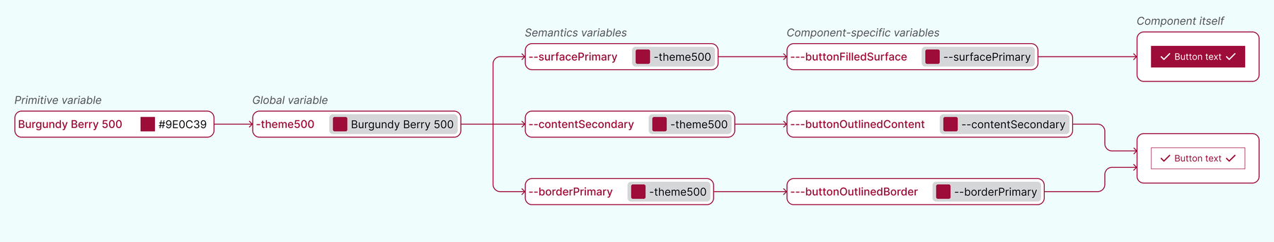
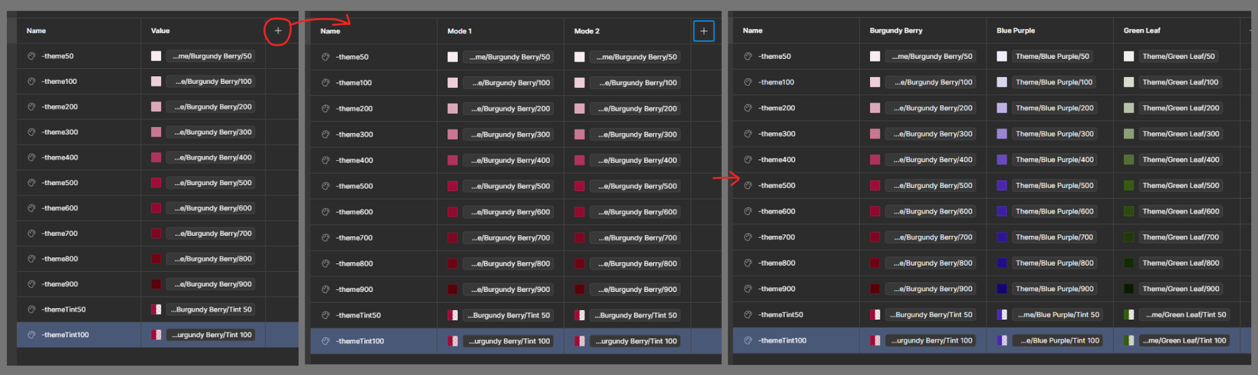
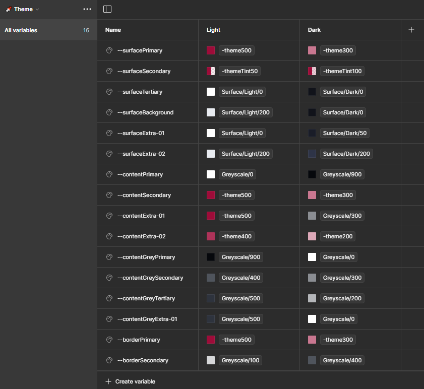
Now that we see that the global variables are working properly, we can start working on our semantic variables, where we’ll use both the global variables and the primitive variables for our values. In the semantic variables, we will focus on both proper naming for the variables we are going to use throughout our designs, and on configuring the variables for light theme and dark theme.

The naming conventions differ from design system to design system, but most of them come from the same pool of words. For our Coffee Shop example, we are going to have the following naming conventions:

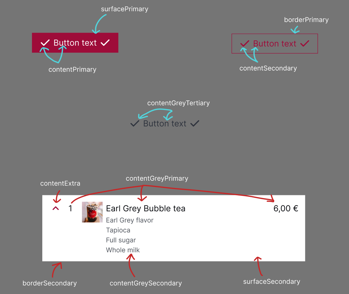
  • “surface” variables, which are going to be used for backgrounds and fills;
  • “content” variables, which are going to be used for text, icons and shapes;
  • “border” variables, which are going to be used for borders, outlines and strokes;
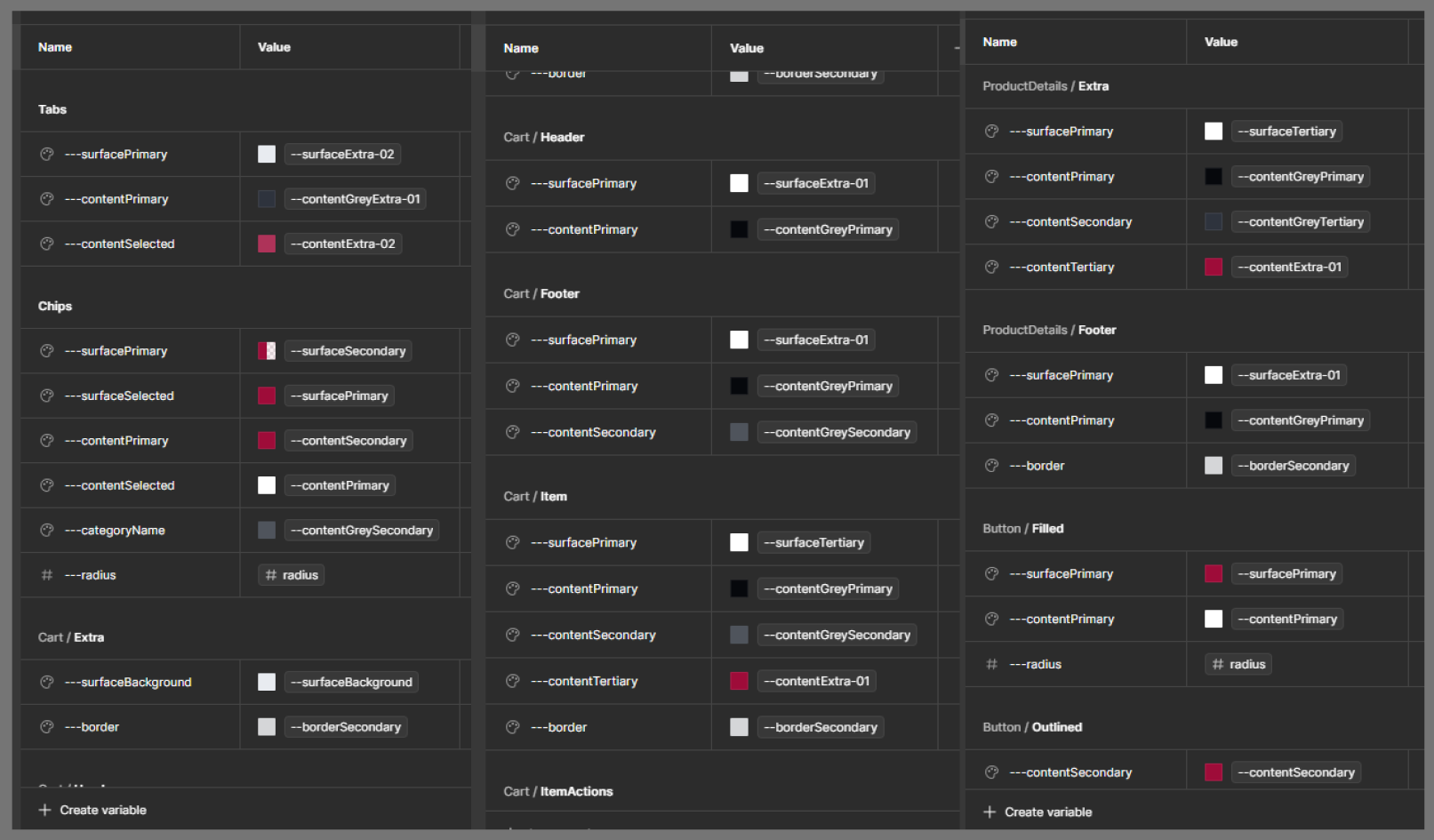
  • All of those mentioned above can also have “Primary”, “Secondary”, “Tertiary” or “Extra” as additional naming, depending on the quantity and importance of said variables;
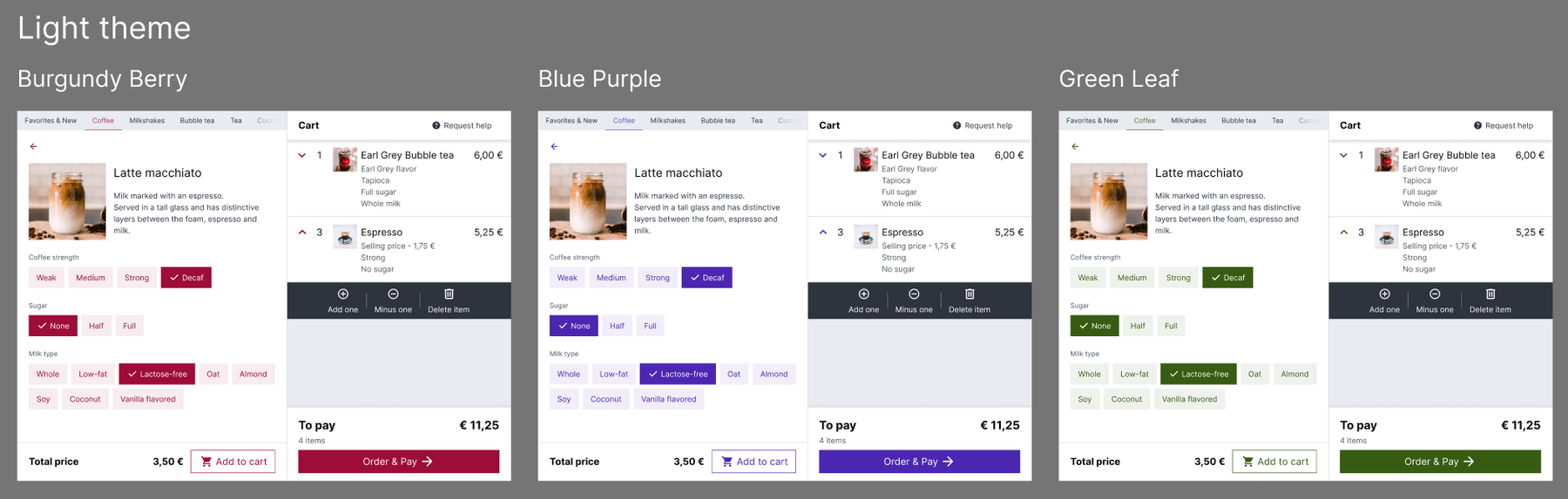
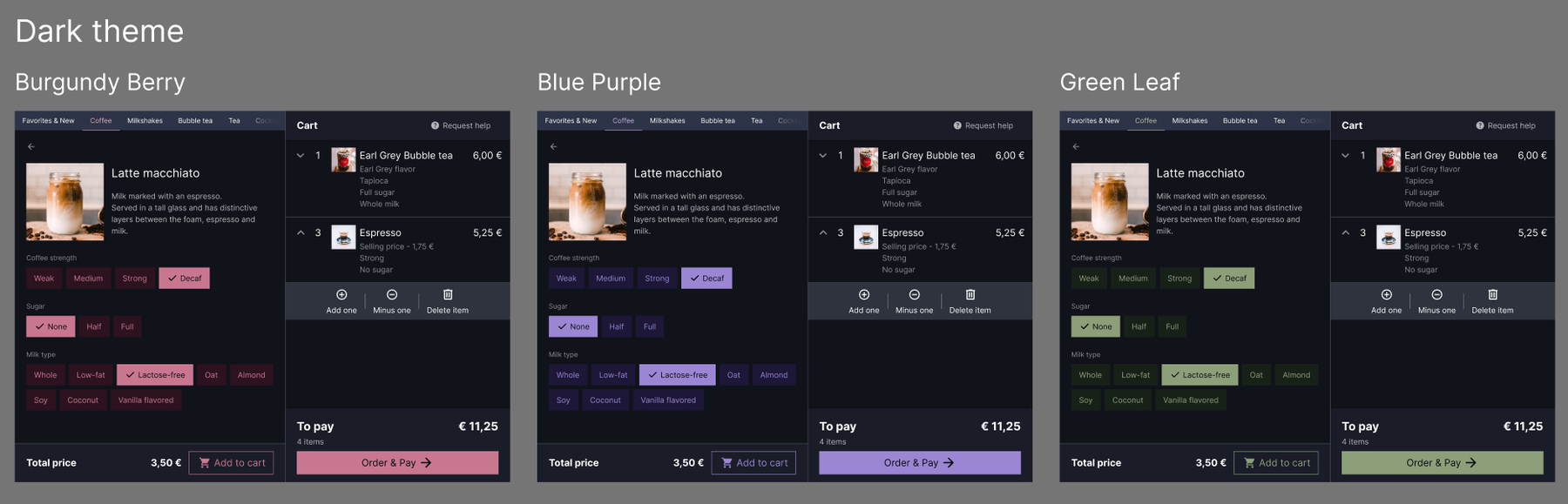
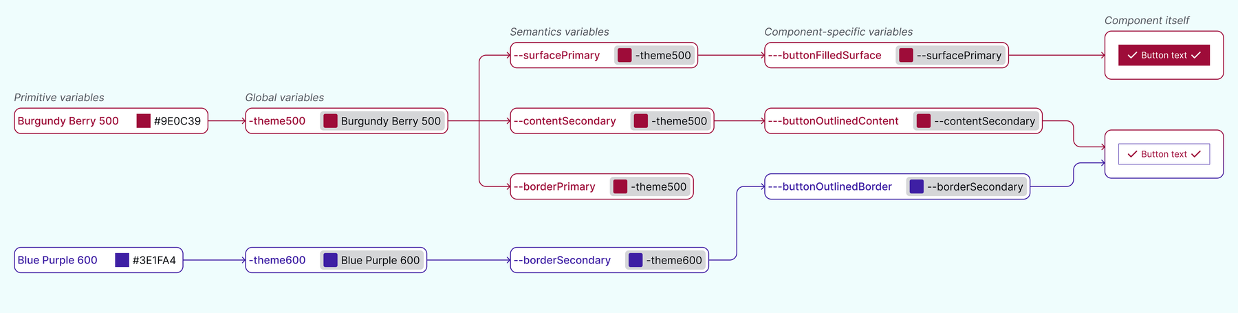
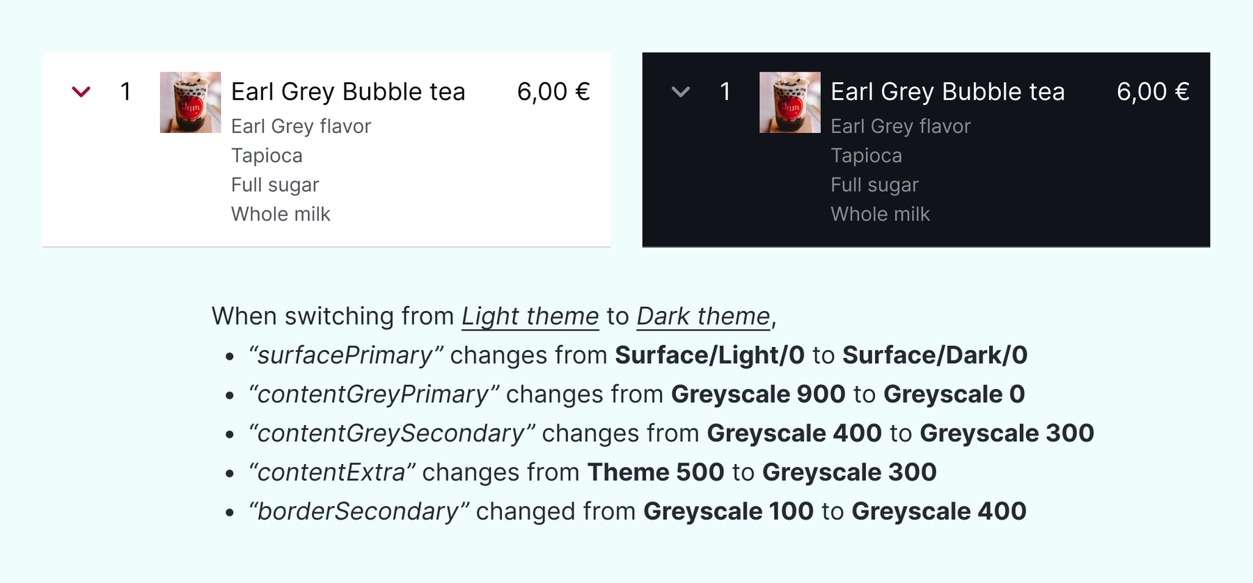
  • Sometimes, one variable can have the same value in “Mode 1” as another variable, but have different values in “Mode 2”, depending on the need of switching themes.

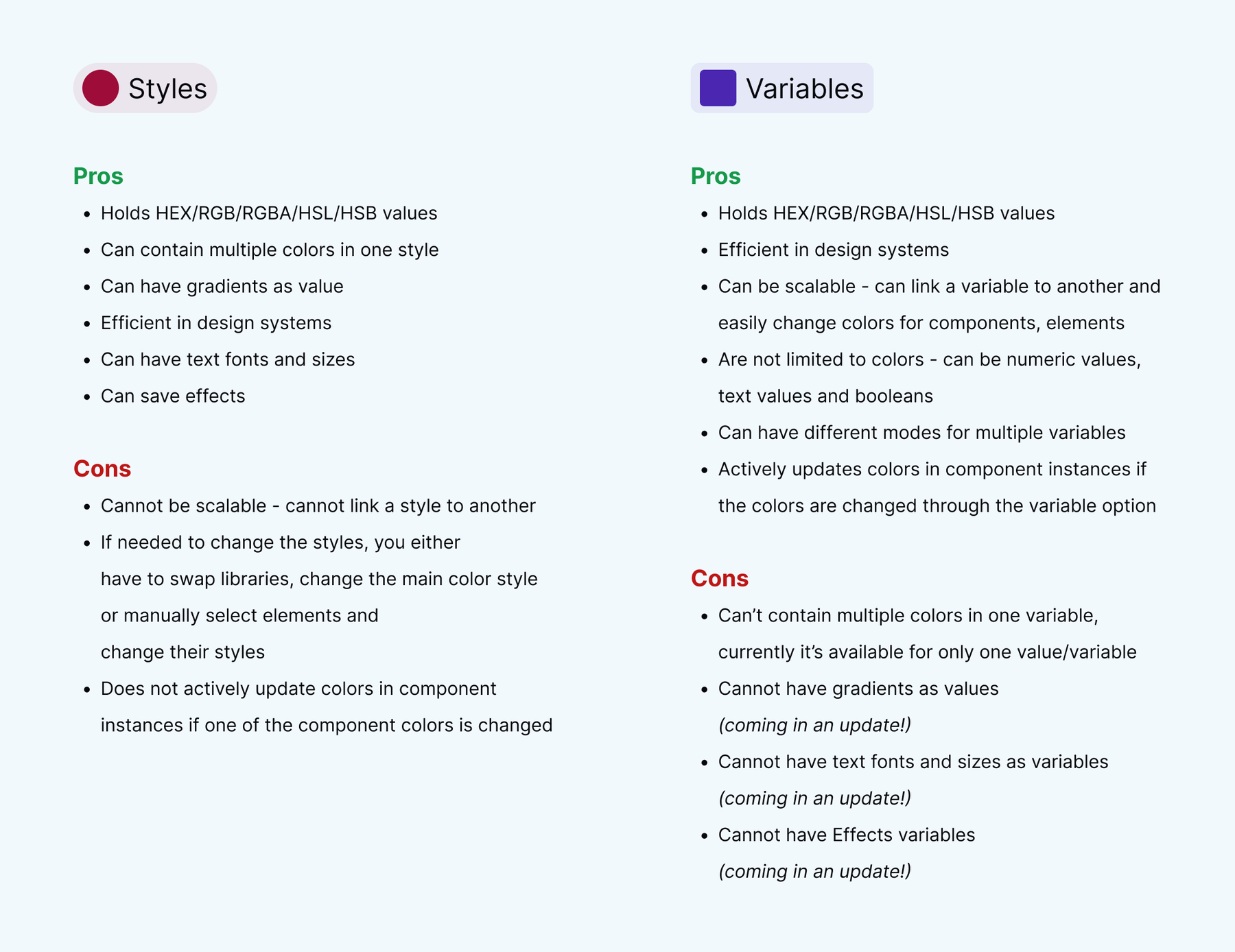
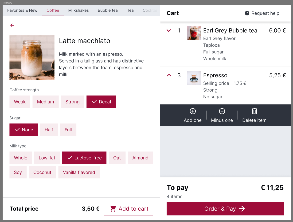
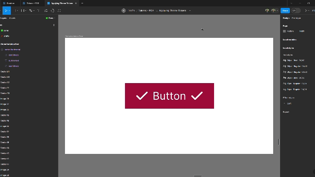
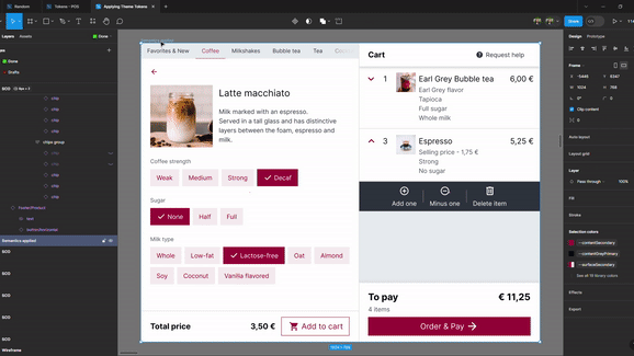
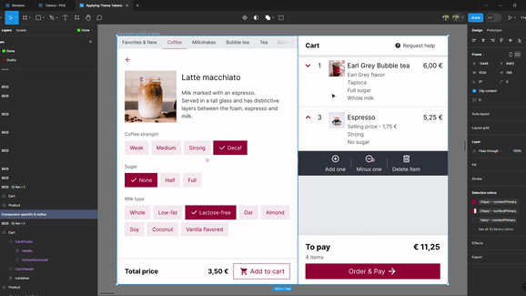
When it comes to choosing where each “surfacePrimary” or “contentSecondary” goes, for example, a way to make a designer’s life easier is to take the components of the application and study how they’re built and what style each element is using, or take fully designed screens and analyze those. For example, in my work, I like to start my study with my most used component, which is a button. Based on that statement, using our Coffee Shop scenario, this is how the study can look:

An overview like the one above helps us in differentiating the variables we are going to build, what kind of variables are going to be built, and how to use them throughout our designs. Furthermore, the naming of the semantic variables can change as we’re building our variable collection, depending on the project’s needs. Considering we have a light and dark theme, it’s also good to analyze how the design elements change when they’re being switched from one theme to another.

After analyzing our components and screens, we can start creating the semantic variables based on our findings. This is how it’s going to look for our Coffee Shop:

At this stage, we can start applying them to our elements, components and screens and watch the magic of swapping between variables happen. This time, we will have two groups of variables available for our elements: one with the color (Burgundy Berry, Blue Purple or Green Leaf), and one with the theme (Light or Dark).

We now have fully working designs that can swap color palettes and go from light mode to dark mode! Depending on each designer’s workflow, some might consider that semantic variables are enough to work with, while others might find it easier to also start working on component-specific variables – for our Coffee Shop project, we are also going to pursue component-specific variables.

The Coffee Shop owner wants to have different roundness of buttons – that can also be done through variables, using number variables which can be assigned to the border radius of our chosen components.

When it comes to component-specific component, we can name them to the component’s needs. For example, for switching themes, we already have “--surfacePrimary” that has a general use; but for the component, we can have a “---surfacePrimary” as well, because it represents the primary fill for that component. Below are the component-specific variables used in our Coffee Shop project.

Applying the component-specific variables (along with the radius variables as well) will result in our designs being flexible to different styles, colors and themes. This approach ensures that designs are easy to understand and maintain. Also, it can enhance communication with developers and other designers, and make the design workflow faster.

Conclusions

Adapting variables early in your design can bring important benefits to you as a designer. In this article, I have gone in depth about adapting different color palettes and themes into your screens, but variables can be expanded into much more, such as using them in conditionals, in prototypes, text translations, min-max sizes, highly interactive prototypes and much more. Variables can also help when presenting design decisions to stakeholders or clients, or when you’re working on a project with multiple clients whom each have different color palettes and you want to adapt your designs for each meeting with them.

References

  1. “Guide to variables in Figma”, 2023, [Online]
  2. “Create and manage variables”, 2023, [Online]
  3. “Apply variables to designs”, 2023, [Online]
  4. “Modes for variables”, 2023, [Online]
  5. “Overview of variables, collections, and modes”, 2023, [Online]
  6. “The difference between variables and styles”, 2023, [Online]