Lovable is an AI-powered web platform that enables users to create websites, applications, prototypes, through natural language. You can simply just type in an idea, a concept, or just describe what you want, and Lovable will not only build it for you, but also propose improvements or next steps for you, based on your context. Lovable also makes it easy to publish your projects to the public, and through the help of Supabase, can also help you database-wise (trust me, it’s extremely helpful). Lovable also allows for easy Figma integration, so in case you already have designs created, Lovable can build using your designs as base.
Author: Anca Stumbea, UI/UX Designer.

Love building your product with Lovable

The need and the goal
The need, in one simple sentence - to validate ideas faster.
Think of all the moments you’ve had an idea, and you wanted to see how a prototype of it would look like. Or those moments where you saw someone write an idea/concept and thought, “I’d understand this way better if I saw a visual of it”. Or even more: think of when you wanted to pitch an idea to someone (a client, a business, a stakeholder, and the list can go on) and you wanted to have a rough idea out to have a starting point for discussion.
Moments like these are exactly where Lovable gets to help.
In order to fulfill our need, we need a goal for the need. Sometimes, it even happens that we can fulfill the need with a goal that comes from a “secondary” need – like it did for me when I thought of what to create with Lovable: I wanted to validate initial ideas faster, and during the days when I was thinking of what to do that could also help, I overheard a discussion happen between colleagues. They were discussing about planning meetings in meeting rooms, and I heard at some point, “It would be much easier to know where each meeting room is”.
The plan
Hearing that, it all started to build in my head: knowing where each meeting room is helps everyone, starting from remote colleagues, in-office colleagues, visits from colleagues from different buildings. With all the ideas that were coming, I knew I could build an application about planning meetings that would also have a map with where all meeting rooms are and what statuses they have.
The plan was simple:
- Need and goal – ✅ checked
- Idea – ✅ checked
- Start prompting and building in Lovable
- Present it to people and gather ideas for fast validation
I already had experience with Lovable and various AI tools, and this time, I wanted to give myself a challenge: to not use Figma at all in my process and to only use the free version of Lovable (which comes with limited credits daily), in order to really test Lovable’s capabilities. I also decided to keep in mind the overall validate-ideas-faster method, which would mean not necessarily polished designs, but working functionality and concept.

The Lovable process
One thing to remember always in AI tools is that the initial prompt matters the most. Moreover, the way you build your prompt brings just as much value. Throughout my use of AI, I’ve found that if your prompt contains context + scenarios + desired result, it will most likely return what you wish for.
For this project, I had two Lovable files created – can you guess which one I ended up using in the end, based on the initial prompt?
And the outcomes of the prompts:
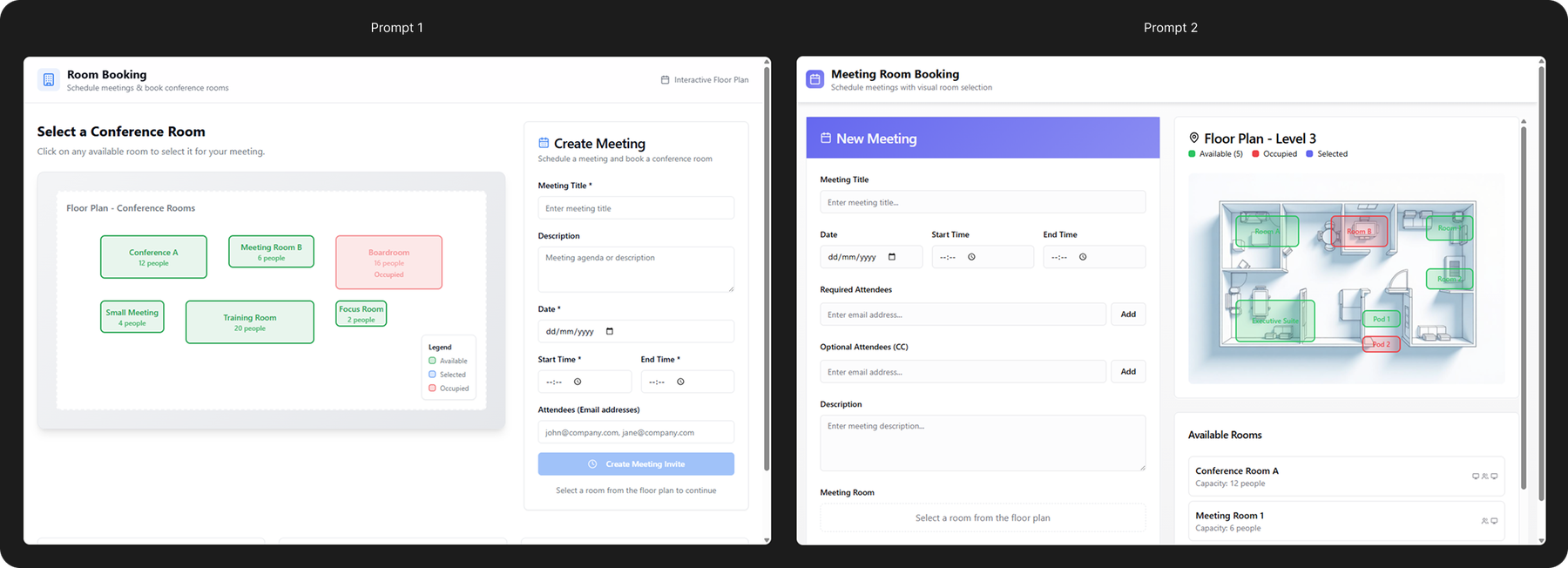
…I went with the second prompt, but speaking from a need to be able to view where meeting rooms are in a building, both prompts delivered results: a fully working functionality from the start, which allowed you to plan a meeting, select a meeting room, and see where it is on the map, all interactive. If we were to analyze, Lovable did its job!
But when you start looking deeper… you see the differences in prompts and in what Lovable built.
The first build went with a more generic approach, creating a lot of assumptions and information that Lovable found on the internet, with usability weak spots.
The second build, I’m not going to lie – was a lot better also because I have learnt from the first one. Lovable already knew more of what it should build, based on the comprehensive context I gave, with enhanced usability, way cleaner UI, and more logic to the functionality itself. This also contributes to one of the amazing facts of Lovable – you can easily scrap a project and create a new one with the same building capacity, which only favors the validate-ideas-faster method.
From this point, with Lovable, you can just keep adding, fixing, iterating with prompts in the chat, and it will build for you – it will even explain to you what it did, so you can understand its process as well. It also allows for easy build history view and revert, so in case something didn’t go the way you wanted to, you can definitely revert to an earlier version and continue from there.
Since I wanted to test what I've created with my colleagues, I polished it a bit beforehand —without going into too much detail, as my goal was to validate ideas faster. Below, you’ll see how I iterated and what prompts I gave to enhance the product:
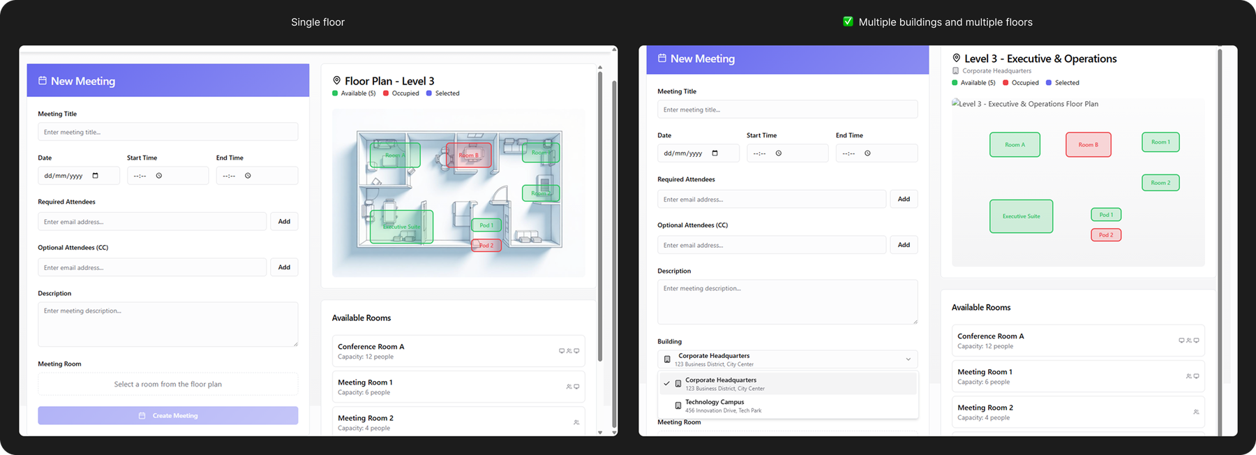
- Initially, Lovable gave me just one floor with multiple rooms. I enhanced with multiple floors with multiple rooms each:
2. Made changes in the form, to increase usability and aesthetics: made the “optional” field not stand out as much, so that the user can focus better on the crucial information first.
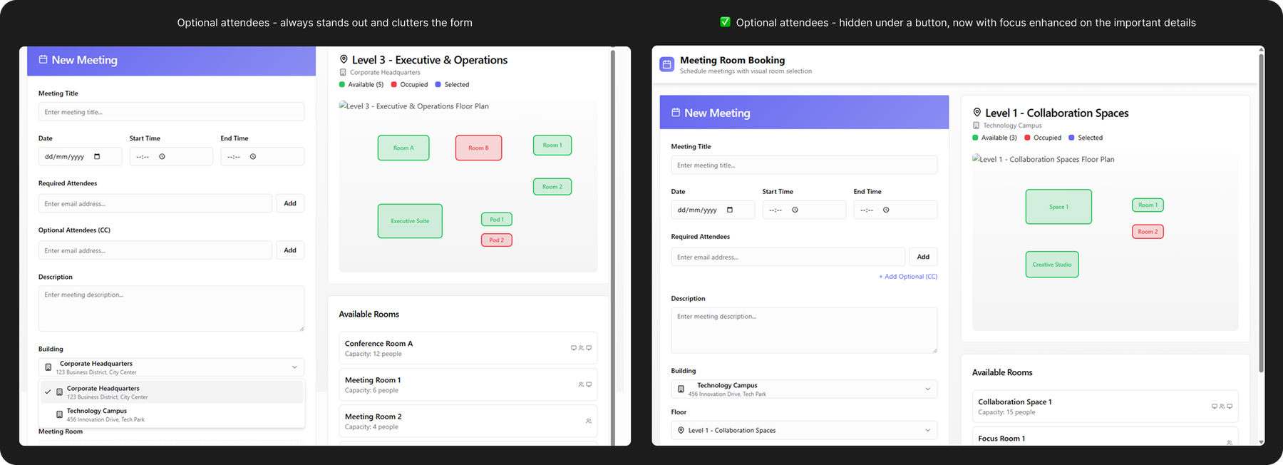
3. Also added icons, which allowed me to run a quick A/B testing here as well with several people to check if the icons bring more clarity (they did)

I also mentioned about easily reverting to an earlier version – I did that as well for this project, and it came so in handy for me when I was already several iterations-deep into something I wasn’t so sure was working or was adding any value to the functionality anymore. Lovable makes this process very easy: either revert from the chat, or go to version history page and revert from there; the best thing about this functionality is that you can preview before reverting.
Testing it out with participants
After I built everything (well, prompted – Lovable did the building), I also wanted to test it out with several participants and hear their thoughts. I still had the need in mind, and wanted to make sure if I managed to fulfill it.
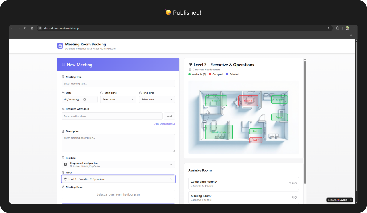
An usability testing plan is the way to go for this project: ask and understand their current daily-life experience, then have participants take a look at the application and complete a task, followed by some questions about their experience. I also wanted to make this plan asynchronous and to let participants complete in their own time – it was easy to create a form link for the questions part, but for the testing part, I couldn’t share the project file itself as it would’ve meant people creating accounts and taking longer until getting to the actual point… so I used one of Lovable’s useful features: I published my project to a Lovable-generated url. That way, everyone had access in an instant.
Initial questions part
Some of the questions included
- How often do you schedule meetings that also include a meeting room reservation?
- Could you tell me about your process when you assign a meeting room to a meeting?
- Tell me about one of your experiences when you were invited to a meeting with a meeting room reserved, and you had trouble finding the meeting room.
- How often do you check where the meeting room is located before planning a meeting?
Based on these questions, I managed to discover not only great information about the participants’ process of meetings with meeting rooms, but also see, just through simple stories, some pain points already. I found that the majority of participants, even if they book meetings pretty often (around several times per week, with one participant possibly going up to 10), they have to do a lot of memory recall in where the meeting room is placed, what facilities a meeting room has, how big it is, and most importantly, if it’s in a building you don’t visit often – they rely on what the planner suggests the best meeting room is.
It was also mentioned that it’s not much of a struggle if they search for the room before the meeting starts, with responses such as “finding the room 5 minutes before the meeting”, “it’s not that hard to walk around the office floor where the room is and check room number on the door”, “turns out it was a door in a blinds pot of the building after you passed a corner”, or even “eventually asked a passer-by colleague”; yet this raises a possible concern: the average user got used to all these inconveniences as part of a normal-pattern when creating or participating in meetings with meeting rooms – and we haven’t even gotten to checking the meeting room part itself.
Application task and questions afterwards
A simple task was provided for the application: create a meeting with details of your liking, assign a meeting room to the meeting, and save the meeting.
After completing the task, participants had to answer another set of questions, which included:
- On a scale of 1 to 10, how intuitive was it for you to assign a meeting room? Why?
- On a scale of 1 to 10, how confident are you in where the meeting room assigned is?
- What did you like/dislike most about this experience?
- What would have made this easier for you?
From the start, just by interacting with the application, I saw that participants were already expressing relief:
- The intuitiveness of the application: 98%
- The confidence in the location of the meeting room: 94%
For the results above, most answers were revolving around how easy it was to see the status of the rooms on each floor plan, both from a map point of view and a list perspective, especially with a bonus that the rooms were color coded (green for available, red for unavailable); the fact that the view was split into 2 columns, where you could focus on the meeting details and the meeting room at the same time; the overall sequence of steps and flow of information was also noted as a plus.
Of course, this also opened up conversations about possible things to improve – and to be honest, this is one of my favorite parts when it comes to understanding people and products.
- Some people mentioned that for the map, it would be useful to know also key places like reception, bathroom, kitchen, as non-selectable, just for orientation purposes – both as a facilitator and as a participant.
- Each room in the application had icons and details showing whether the room had a whiteboard, a sharing screen, and capacity of the room – one thing I found really interesting and very human was that some participants went beyond just the “technical tools” they would need for the meeting. They mentioned that rooms with natural light, large windows and a beautiful view also contributes significantly to how pleasant the atmosphere is in meetings. (to be honest, I didn’t even consider how much it could influence, and now I understand better and agree)
- Some participants went even further than just the map of the meeting rooms – they mentioned that having a 3D view of the room as well could significantly help them in deciding if a room is fitting for them or not, for scenarios such as holding different workshops, trainings, sessions with multiple people, and much more.
Conclusions – were the needs achieved?
When it comes to the application needs, I consider that yes, they were met: users were able to see and know much easier where each meeting room is when booking a meeting room.
When it comes to my needs? That I wanted to see if I could validate ideas faster?
Yes. Definitely.
With the help of Lovable, I managed to save a tremendous amount of time, starting from thinking about the layout, the form information, the maps of the meeting rooms, to publishing the project and actively testing it out with people. Collecting it all together, I would put it in around 2-3 days of work (with a paid Lovable account – considering I did it with a free account with limited credits, it would take a bit longer), compared to probably a week or two of work if I were to do it the “original way”.
Is using Lovable worth it when it comes to validating ideas?
Depends, but I’d say yes.
There are certain markets or applications that Lovable isn’t trained on, so you have to put in a little more time to craft your prompts and explain what you mean. This comes especially for Non-Disclosure Agreement (NDA) projects. But if we were to focus on the positives that make me say “yes”, it’s the fact that it’s quick, it understands easy if you put in the time, it also gives you extra functionalities and details that you maybe didn’t even think of, generates a great looking UI and is intuitive to use, and you can easily publish prototypes so people can access and test from everywhere anytime. And I definitely think it’s useful to test a certain flow with Lovable prototypes when you want to quickly discuss with a client about a functionality they want to add to the main application without focusing on the looks, to check assumptions, needs, behavior and more, thus saving time, energy, resources and even development effort.
Is Lovable for everyone?
Yes! And I encourage you to try it out. It’s one of the most fun ways to validate from the beginning what you want to do, and to help you open conversations and collaborate. These little aspects definitely make you love building your products with Lovable.
Note: Big thanks to everyone who supported me and helped me in the creation of this article <3.
Useful links
- Test out Lovable: https://lovable.dev/
- If you want to test out the application I have made: https://where-do-we-meet.lovable.app/ (keep in mind that sometimes the map images break 😊)

