From Chaos to Clarity: Using AI to Organize Your Icon Library

In the fast-paced world of design, tools that enhance creativity and efficiency are essential. Let me share with you how our latest upgrade to the internal Icon Library is transforming the design landscape.

This article explores the significant enhancements I’ve worked on the internal Icon Library, focusing on improvements that streamline the design process, increase efficiency, and reduce costs for our company.

Author: Eduard Chirileac, UI/UX Designer

Eduard Chirileac

UI/UX Designer

The Icon Library has always been a cornerstone in our design system, offering a wide array of icons essential for various projects. However, despite its extensive collection, we as designers encountered several challenges that needed to be resolved:

  • Unorganized Library: The previous version was cluttered, making it difficult to find the right icons quickly.
  • Unclear Naming Conventions: Icons were named inconsistently, which further hindered quick access.
  • Time-Consuming Searches: Without clear descriptions, finding the right icon was a tedious process.
  • Dependency on Adobe Illustrator: Building icons required Adobe Illustrator, adding complexity and cost.
  • Proportion Issues: Using fixed size values when resizing icons often led to disproportionate results, causing additional adjustments, and wasted time.

These challenges were frustrating and significantly slowed down the design process. Addressing these issues would make the library more efficient and user-friendly.

Now let’s dive into the problem and solution for each challenge we face.

Enhanced Organization and Naming

Problem:
Finding the right icons quickly was a constant struggle due to an unorganized library and unclear naming conventions.

Old approach - searching for an icon in assets or swap instance panel.

Solution:
I decided to reorganize the icons into more intuitive categories and implement a clear, systematic naming convention.

New approach - searching for an icon in assets or swap instance panel.

Icons are now categorized by function and style, allowing for easier navigation. This reorganization has been a game-changer for many of us, making the design process smoother and more efficient.

The new naming conventions are straightforward and descriptive, creating a more organized and accessible folder structure. These improvements have expanded our icon library at a fast pace and made it easier to adapt icons to project needs.

Icon Descriptions for Easier Searching

Problem:
Finding the right icon was a time-consuming task due to the lack of clear descriptions. Back then, searches could only be conducted by the icon's name, rather than its specific function or representation.

Old approach - an icon with same description as the name of it.

Solution:
I integrated detailed descriptions for each icon, making it significantly easier to find what we need quickly.

New approach - an icon with detailed description.

I leveraged advanced AI tools like Gemini (at that time Bard) and/or ChatGPT to generate accurate and detailed descriptions based on the icons' appearances. This ensured each icon was described comprehensively, capturing its unique features. These updates have made it much easier to find icons using associated words, catering to different thinking styles.

A screenshot of a Bard AI conversation defining tags for a clock icon, listing general tags (e.g., time, timer) and context-specific tags for productivity apps and games.

To efficiently update and manage these descriptions, I used the "Bunch Description Change" plugin in Figma. This plugin allowed us to update descriptions in bulk for multiple selected icons, simplifying the process and ensuring consistency. The descriptive updates have streamlined the design process, saved time, and reduced frustration.

A screenshot of "bunch description change" plugin showing the function of changing descriptions in bulk.

NOTE
Updating the icons with descriptions using the traditional method would have been a time-consuming process. Initially, I would have needed to conduct research to find appropriate descriptions. Then, I would have had to use Figma to update each icon individually, as there is no feature allowing for the simultaneous update of multiple icons. This manual approach would have significantly extended the time required for the task.

Streamlined Icon Building in Figma

Problem:
Building icons in Adobe Illustrator was adding unnecessary complexity and cost.

Solution:
I transitioned the entire icon-building process to Figma, eliminating the need for Adobe Illustrator. Sorry, Adobe.

The process of recreating icons in Figma is straightforward and efficient. To support designers in this transition, I created a comprehensive step-by-step guide and tutorial.

This includes:

  • Icon Grid Component: Instructions on using the icon grid component for consistent and precise icon design.
  • Creating Icons from Scratch: A detailed tutorial on how to design icons from the ground up within Figma.
  • Creating Composed Icons: Guidance on combining primary and secondary icons to create more complex and versatile icons.
A screenshot showing instructions for creating icons using the Icon Grid component, creating icons from scratch, and composing primary and secondary icons.

This shift has not only reduced costs for the company by eliminating the need for additional software but also streamlined the entire design process. The tutorials provide valuable knowledge and skills, empowering designers to maximize their efficiency and creativity. The transition from Illustrator to Figma was seamless and beneficial, thanks to these guides.

Linked Proportions for Resizing Icons

Problem:
Resizing icons often led to disproportionate results, causing additional adjustments, and wasted time.

Two side-by-side images: the left shows a icon with dimensions 24x24px and an unlocked aspect ratio, while the right shows the same icon with a width set to 128px, without maintaining the aspect ratio.
Two side-by-side images: the left shows a icon with dimensions 24x24px and an locked aspect ratio, while the right shows the same icon with a width set to 128px, maintaining the aspect ratio.

Solution:
Even if it seems like a minor change, I made constraints proportions linked by default, ensuring that icons maintain their proportions when resized.

By linking constraints proportions, designers can now resize icons without worrying about distortion, saving valuable time and effort. This has been a significant improvement, making our workflow much smoother.

After defining the process for the icon library, our contributors Cezar Stirbat and Andreea Condrea played a crucial role in upgrading all icons with detailed descriptions following the established process. Their hard work and dedication have been instrumental in bringing these improvements to life.

Special thanks for their contribution! 👏

Success Stories and Testimonials


"I used to run from 'design icon' tasks or at least postpone them until the last possible minute. However, now, having to use one software to build both the design and the icons has made things easier for both me and my laptop. Building icons in Figma has never been easier and quicker using the guidelines, components, naming conventions, and review process established within our internal design system. The ease in build and review has expanded the icon library at a fast pace, and I can easily search for 'parts' using keywords and adapt them to my project needs." — Stefana Leonte


"The internal design system Icon Library is a complex and complete library for different scenarios that we can encounter in the applications that we design.

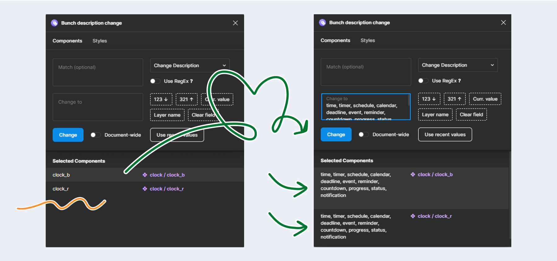
With the new update of descriptions for each icon, it is much easier for us to find an icon. Each of us can search for an icon using a word we associate with it, which caters to our different styles of thinking and working. This update has made our workflow faster and more optimized." — Cezar Stirbat


"The improved icon library has exceeded my expectations, especially regarding 'icon descriptions.' At first, I did not realize how much of an impact icon descriptions would have, but it was exactly what I needed. I can look for an icon using a description keyword without needing to know its exact name. This has been amazing!

Building icons in Figma seemed daunting at first, as I was used to Illustrator and the Shape Builder tool. But the icon building process guide introduced me to the Bucket tool, which is very similar. The transition from Illustrator to Figma was seamless, and I've added a new tool to my daily design routine." — Anca Stumbea


"The internal Icon Library in Figma is very easy to use, especially since the icons were reorganized into intuitive categories.

The description part is very helpful since sometimes we search for an icon with a different name. Now we can find it easily with a similar word without needing to guess the exact name." — Petronela Rosca

Conclusions

This enhancement has greatly improved the usability of the icon library, allowing us to focus more on creativity and less on manual adjustments.

Centric is dedicated to continuous innovation in design tools, aiming to enhance the designer's experience and creativity. The Icon Library upgrade offers enhanced organization, detailed descriptions, linked proportions for resizing, and streamlined icon building in Figma, all contributing to a more efficient and cost-effective design process.